Let’s start with the bad news.
As of January 2015, the online global conversion rate is 4.2%.
That’s according to the Fireclick Index, a worldwide leader in web metrics and analytics.
4.2% is a scary number. But it’s remainder -- 95.8% -- is even more blood chilling.
At AmeriCommerce, we like to call that 95.8% the “do-nothing” rate, which is exactly what it sounds like: the percentage of people who, on average, come to a site and do nothing.
They don’t “sign up.” They don’t “read more.” They don’t “add to cart.” And they don’t “buy.”
The cold, hard reality is 95.8% of the world’s internet traffic -- 95.8% of your site’s traffic -- comes and goes. And that is it.
They do nothing.
Even more disheartening is the fact that all that traffic is far from free. In fact, companies typically spend $92 to bring customers to their site, but only $1 to convert them.
For all these reasons and more, conversion is a hot topic.
As one of the largest online eCommerce platforms, we’re constantly fielding questions from our store owners about how they can improve their conversion rates and turn shoppers into buyers. What we’ve noticed in their interactions is a sobering trend: Even the smartest store owners are killing their conversion rates by making a lot of the same mistakes.
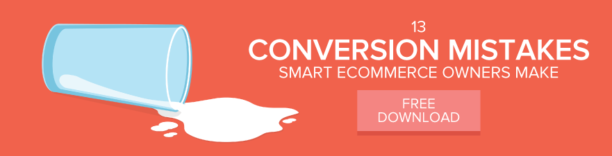
We’ve identified 13 of the most common and costly conversion mistakes and packed each one full of examples of stores and brands doing it right in our ebook 13 Conversion Mistakes Smart Ecommerce Owners Make… along with a few who are doing it wrong.
Even better, every mistake ends with actionable tips on how you can fix the mistake and reverse the 95.8% donothing rate at your own online store. So, are you ready to supercharge your sales and convert shoppers into buyers?
Conversion mistakes do come in all shapes and sizes. Our ebook hits the most important ones. But in this post, we'll just look at the 7 visual mistakes that ecommerce owners typically make. See if you are missing the mark...
The 7 Biggest Ecommerce Design Mistakes To Avoid
1.
Your images are poor quality
Didn’t
think your product image was important? Think again.
According
to research,
67%
of consumers say that the quality of a product image is very
important
when selecting and purchasing a product.
Now
that's a huge number of people that you could be putting off buying
your stuff because your images are low quality. Think about it, a
product image tells you everything you need to know about what you
can expect if you buy it. So it needs to sell it to the visitor, as
much as the description will.
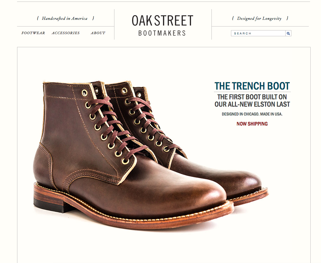
Check
out this example from
Oakstreet
Bootmakers. The product image is high quality, it's simple, stylish
and there are no distractions. That's what you need to aim to do with
yours.
How
can I fix it?
If
you don't have the budget to bring in a professional then don't
worry, you can still make your products look good. Take a look at our
DIY
product
photography cheat sheet
for actionable tips on how to solve this problem.
2.
Your visual hierarchy is a mess
When
a shopper comes to your site, your main goal should be to convince
them that they need your product in their lives. And how do you do
this? By providing clear visual hierarchy.
Visual
hierarchy basically influences what the human eye will look at first.
So when it comes to the design of your site, your visitors should be
drawn to your product first.
It's
not just about the product image either. The product features, price,
size and CTA needs to be in a clear order so that you push the
visitor towards the sale with ease.
How
can I fix it?
Think
about your product pages on your site. When you look at them, what
stands out to you first? Does it follow the right hierarchical
structure? Important elements such as your product and the CTA need
to stand out, ahead of less important elements such as size or color.
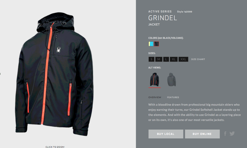
Check
out this example from
Spyder.
They have the product image as the main element, the product
information is smaller, and the CTA stands out as highlighted boxes
for the user to easily click.
3.
Your pages are too cluttered
So
you may have a lot of products that you want to sell, and that's ok.
But you need to make sure that your product pages don't look
cluttered as this can be really overwhelming for the visitor. Giving
them too many options may not always be a good thing when it's
stuffed all onto one page.
How
can I fix it?
Streamline
your entire site so that it's simple and clear. You can still give
your visitors different product options, but this can designed so
that they can visit another page to view these options.
Don't
put too many products all on one page. If you have similar products
that you want to guide them to, then direct them to a different page.
And remember that it's ok to have white space!
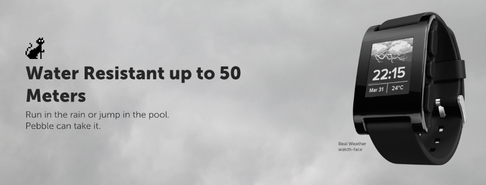
See
this example below from
Pebble.
Their website is clean, clear and crisp.
4.
It's too hard to navigate
Like
everything else on your site, the navigation design needs to be clear
so that your visitors know how to get from A to B.
According
to
Forrester,
an incredible 50% of sales are lost because your visitors can't find
your products? This is bad news for your brand and bad news for your
sales.
But
that's not the worst of it...
Forrester
also cite that 40% of visitors won't actually come back to your site
if they had a bad first visit. Which means if they get frustrated by
your poor navigation then you could actually put them off for good.
How
can I fix it?
What
you need to do is get into the mind-set of the customer and show them
where to go. It's worth using a
heatmap
tool
to find out where your customers like to go on your site, so you can
work out the best navigation for your store.
Don't
forget to have a search bar in clear view for your visitors to be
able to search for what they are looking for.
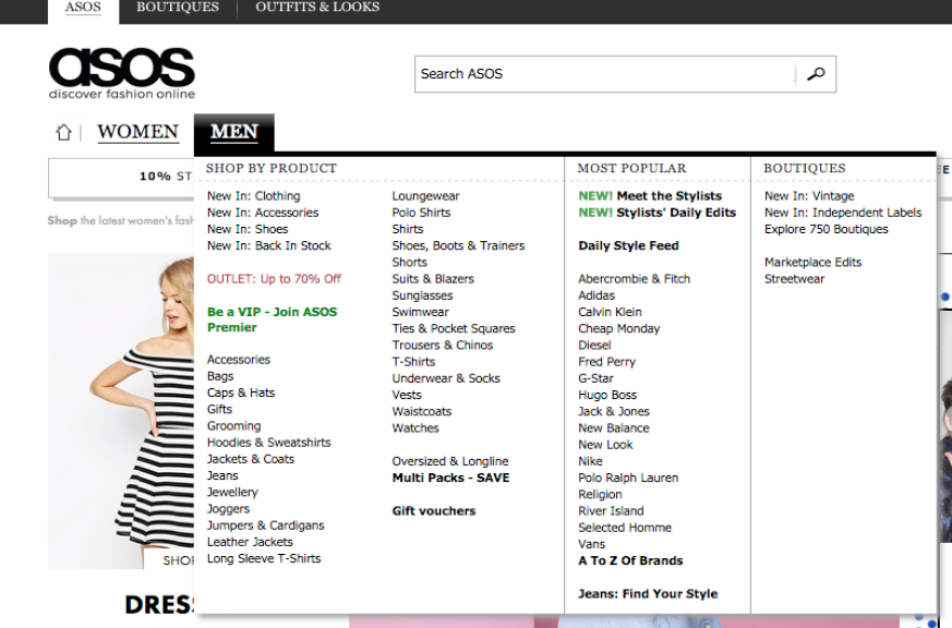
If
you take a look at
Asos
then you can see how they offer an easy-to-use navigation. They split
their products into simple categories, and have a user-friendly
search bar at the top of each page to help people shop around for
what they need.
5.
Your sign up form is complicated
The
sign up process is the step right before they reach the sale, so you
really need to make sure that you don't ask too much, too soon. Sure,
you'll want their details so that you can sell to them well after
they've purchased, but how much do you really need to know about
them?
How
can I fix it?
Your
sign up form needs to be as painless as it can possibly be.
When
designing it, make it as simple as their name, or even just their
email address. That's all you really need. If you want to get to know
more about them then you can approach them at a later date, once they
start to become a regular customer.
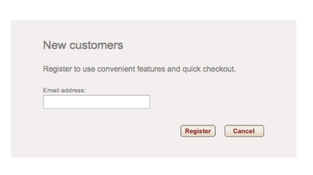
As
you can see from the
Gap
store, they've made it so simple for new customers to join.
Another
great idea is to integrate the registration with the persons social
media, so they can simply connect their social accounts without
having to input any details.
6.
Your design is a little dated
The
truth is, first impressions count for everything, so the overall
design of your entire site needs to keep up with the latest trends.
Have you ever gone onto a website that looks like it's from the 90's
and jumped right back off? A dated design not only looks bad, but it
makes you seem unprofessional.
Building
trust is key to the success of your store, so make sure you stay on
top of design trends and keep it consistent across your entire store.
How
can I fix it?
We're
not saying you have to be an expert web designer. In fact, with our
Ecommerce
platform
we offer tools and templates so that you can build a slick design
without having to have expert knowledge.
You
can check out some of
ecommerce themes
to see what you can expect from our web design themes. Each of our themes are highly customizable and can be tailored to your own look and feel.
7.
Your site is not responsive
Did
you know that
34%
of smartphone users go online mostly using their phones? And with the
amount of mobile devices expected to rise, you need to make sure that
your website is responsive.
Think
about how often you visit a website using your smartphone. Probably
all the time right? If your online store isn’t set up to be
responsive then you may end up losing out on a lot of sales.
How
can I fix it?
Make
sure your site is fully optimized and responsive for mobile users. A
mobile-friendly site still needs to offer the key points that you
want to get on your site, but ensuring that it works on a smaller
device.
To
help you do this, we've made sure that our
Ecommerce
platform
is 100% mobile friendly, so you can provide an awesome user
experience to all of your shoppers.
Takeaway
As
you can see from the above examples, the design of your online store
needs to be clear and simple. You need to make it effortless for your
customers to get to where they are going, and you can do that by
avoiding these design mistakes.
13
Conversion Mistakes Smart Ecommerce Owners Make
Design
mistakes aren’t the only thing that can hinder your conversions!
That's why we've put together this eBook, to offer up the biggest conversion mistakes ecommerce owners make. See if you are missing the mark on any of these...