As
an online
store
owner
,
do you wish that you could improve your conversion rate?
Silly
question, of course you do.
You
may spend a lot of time perfecting your homepage, but how much time
do you spend on your product pages?
If
it's not a top priority then this could be the route of the problem.
Your
product page is that last step right before the checkout, and if you
don't include the
right
elements that triggers people to click on your CTA, then it can
break the sale.

So this week we're going to take a look at 7 product pages that make us
want to buy, and highlight the key reasons why.
Let's
get started.
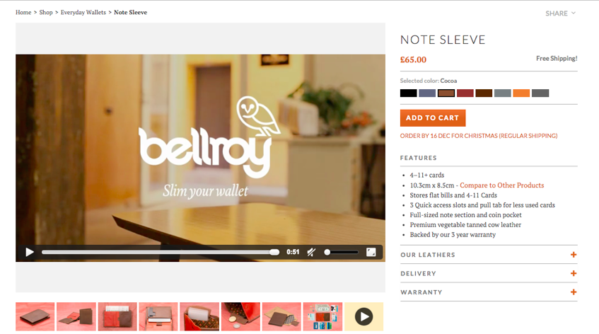
#1.
Bellroy
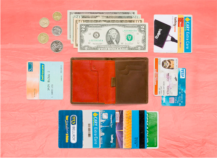
There's
nothing more frustrating than having a lumpy pocket from a wallet
that's packed like sardines with your entire life.
And
that's why Bellroy was founded. The creators set out to design a
stylish product that was thinner than your normal wallet, yet still
managed to fit in everything that you could possibly need.
It's
a great idea, but it's their product page that really caught our eye.
Why
does it make us buy?
-
A
video that explains all
When
you first visit a product page, you're greeted with a video that
shows how useful the wallet can be. It gives you a peak inside and
showcases all of the product benefits in an engaging animation.
On
the product page customers can find 8 different images, that all look
incredible. You can see close ups, size comparisons, nifty features
and how much can actually fit inside the wallet.
But
that's not all...
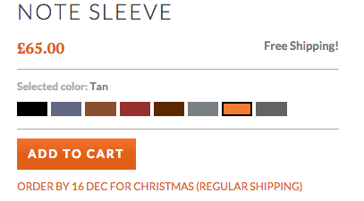
This
particular wallet comes in 8 different colors and the customer can
click on each color to see which one they prefer. This can really
help push a customer to the sale, as they get to see exactly what the
product will look like if they purchased it.
What
can we learn?
The
takeaway from Bellroy is that visual communication counts for a lot.
Did you know that people remember
80%
of what they see and only 20%
of what they read?
It's
true, the better your products look, the more likely you are to see
the sale.
Make
sure that on your own site you're providing professional images and
videos so that the visitor can see exactly what your product looks
like.
Our
top tips include:
-
Showcase
various angles
-
If
the product comes in different colors, show it in each
-
Highlight
the benefits using images and a video
-
Stay
true to your brand style
Resources
to help further:
Spark
Pay:
Product
photography cheatsheet
Econsultancy:
8
different ways of using product videos in Ecommerce
Quora:
What
are good cameras for product photography?
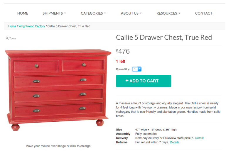
#2.
Wrightwood
Furniture
is often an expensive investment, especially if you're looking for a
unique style.
That
was the idea behind Wrightwood. This family-owned business designs
and sources rustic products, without the high cost associated with
unique furniture.
Why
does it make us want to buy?
One
of the most crucial aspects to a product page is that it includes a
prominent call-to-action and the secret lies in visual hierarchy.
The
idea behind visual hierarchy is that you design each element on your
page in the order that you want the user to notice them.
So
on a product page, naturally the number one thing that you'd want a
visitor to notice would be your product image, so you'd make that
stand out ahead of anything else on the page. But what's next?
Yep
you guessed it, it's the call-to-action.
It
should be designed to trigger a 'buy me' response after seeing the
product itself, so that's why Wrightwood use a contrasting color,
made sure it's bold, and prominently placed it on the page.
Creating
a sense of urgency is a great little tactic that can help you
convince more people to buy. In fact, according to
this
case study on Conversion XL
,
including stock information on your site can increase conversions by
332%!
You'll
often find that customers come along to simply browse. They like the
product sure, but they may decide to come back at a later date. But,
if they know that there is a limited amount of stock available, they
are far more likely to make the purchase there and then.
Wrightwood
features the stock levels under every call-to-action button and
colors it in red so that it stands out on the page.
What
can we learn?
You
want people to convert then you're going to have to make it
abundantly clear what they need to do. Make your add to cart buttons
scream 'click me', and include the stock information to get people
twitching to buy.
Our
top tips:
-
Design
your CTA on a clear background
-
Make
your CTA a different color to everything else on the page
-
Keep
it bold, keep it simple
-
Integrate
each page with your stock levels to create urgency
Resources
to help further
Spark
Pay:
Supercharge
your calls to action - ebook
Hubspot:
17
call-to-action examples you can't help but click
Crazy
Egg:
How
to increase conversion rates by introducing urgency
#3.
Odd Pears
Let's
all take a second to think about socks.
They're
a vital piece of apparel, but there isn't
much
you can really say about them, is there?
Well
Odd
Pears
set out to change that. They've created a product that caters for all
those kooky people out there that like to wear odd socks.
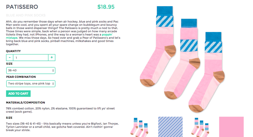
Why
does it make us want to buy?
-
Engaging
product description
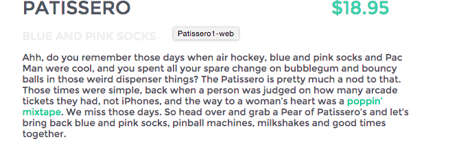
Good
product information is super important, but it's often hard to find.
Write a compelling description and not only will you convince people
to buy your product, but it will also
improve
your SEO
by having unique content on your site.
And
that's the very reason that we love the Odd Pears' product pages.
They nailed it.
When
it comes to selling your product, you need to be able to convince
people to buy with engaging copy. Odd pears manage to achieve this by
writing for their audience. It's fun, it's nostalgic and it's
relatable to their intended audience.
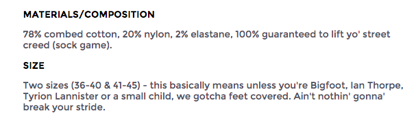
In
addition to writing an engaging product description, it's always
worth providing extra information. Does your product come in
different sizes? Colors? What ingredients or materials are used to
create it? By including this type of information, it will provide
extra clarity to your audience.
And
as you can see from Odd Pears, they don't compromise on brand voice,
even when explaining something as mundane as sock sizes.
What
can we learn?
The
takeaway here is that you can make anything enticing, you just need
to tell a good story. We're not saying make your copy completely
wacky to sell your products if that's not who you are as a business.
Stay
true to your brand voice and use the same language that your audience
uses.
Our
top tips:
-
Create
buyer personas so you can use their language
-
Tell
an engaging story and make each product come alive
-
Don't
copy and paste manufacturer descriptions
-
Bullet
point additional info, features and benefits for an easier read
Copyblogger:
10
ways to write damn good copy
Kissmetrics:
7
simple steps to writing product descriptions that sell
Ometria:
8
Ecommerce brands with enviably good website copy
#4.
Asos
Asos
is an online “global fashion destination for 20 somethings”. They
sell apparel worldwide and have been in business since 2000, so it's
safe to say that they know a thing or two about creating a good
product page.
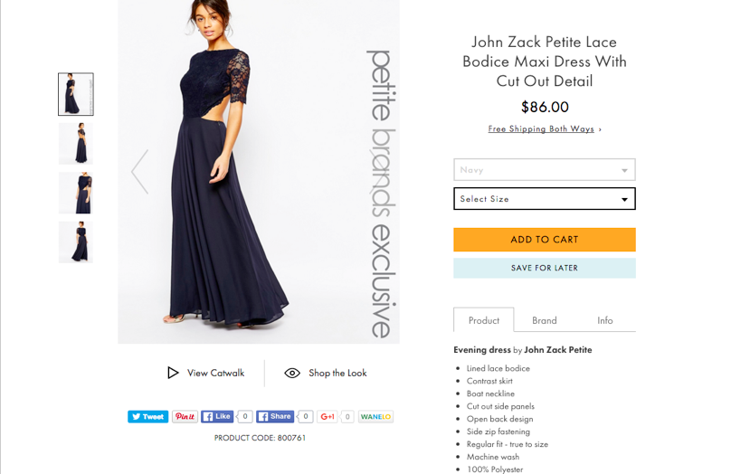
Why
does it make us want to buy?
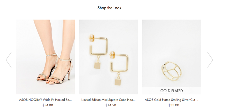
-
The
up-sell and cross-sell
A
big plus for Asos is that they make a concerted effort to up-sell on
every product page.
If
a customer is interested in this dress for example, they suggest
accessories that will go with it, to increase the order and give the
customer different options.
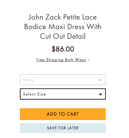
-
The
'save for later' option
As
much as we'd love every visitor to commit to buying there and then,
it doesn't always work out that way.
Did
you know that typically 2% of shoppers will convert on a first visit,
but retargeting brings back the other
98%?
If
you feature a wish list or save for later option, the visitor can
come back to it at a later date, and using the power of retargeting
ads, you can make darn sure that they do!
For
example on the Asos site, if you save an item in your cart or leave
before you make the purchase, Asos will target you across social
platforms to entice you back to make the sale.
What
can we learn?
Give
your web visitors the option to browse similar products, or come back
to you at a later date. The more options you provide, the more likely
it is that you will increase your average order value.
Our
top tips:
-
Provide
a personalised experience to each web visitor to increase the chance
of conversions.
-
Showcase
products that are similar to what the customer is browsing.
-
Adopt
a retargeting campaign to remind customers to come back to you.
Resources
to help further
Crazy
Egg:
How
to leverage remarketing and retargeting for higher conversions
HubSpot:
4
tips to master the art of upselling and cross-selling
#5.
Gap
With
a successful Ecommerce store and thousands of retail shops worldwide,
Gap is one brand that doesn't need any introductions...
Why
does it make us want to buy?
When
a person is shopping online, they'll probably be thinking about some
– if not all – of these questions...
-
How
much does shipping cost?
-
How
much would it cost to return?
-
How
long do I have to wait before I receive it?
Typically
cart
abandonment rate
for online retailers falls between 60% and 80%, and if these popular
questions aren't answered before the checkout, then it's likely that
you'll end up losing the sale.
As
you can see from this product page, the customer can find it in store
if they need it urgently, they're given a detailed run down of
shipping and returns options, and even given the option to print out
a shipping label for peace of mind.
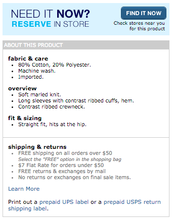
What
can we learn?
Being
clear with your customers upfront can really help increase
conversions. If people find out that you offer free shipping then
that's something you should highlight.
Our
top tips:
-
Include
shipping and return info on the product page
-
Be
clear – highlight benefits such as free shipping
-
Include
shipping labels
Resources
to help further
Econsultancy:
12
excellent ways to present ecommerce shipping information
#6.
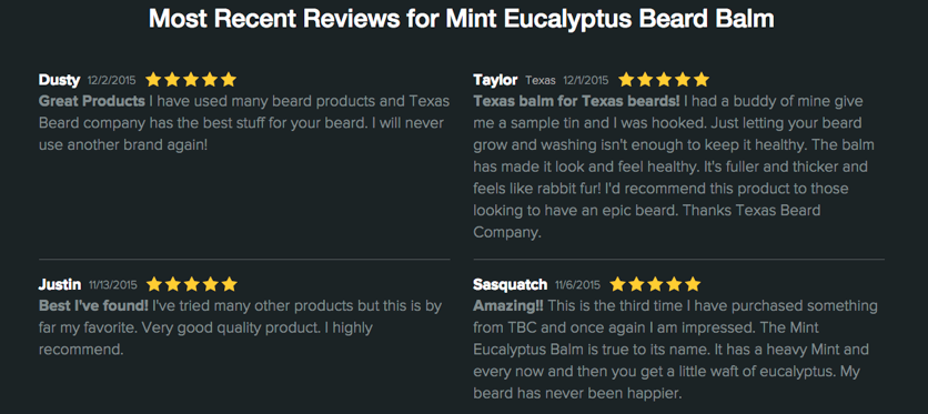
Texas Beard Company
Texas Beard Company was set up by a bunch of dudes with – yep you guessed
it – beards. They wanted to create a set of products that would
offer high quality beard care to those who need it!
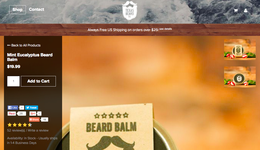
Why
does it make us want to buy?
A
big trigger to influence more conversions is if you feature reviews
on your site. According to an
eMarketer
study
,
customer reviews were trusted 12x more than manufacturer product
descriptions.
If
you scroll further down the product page on Texas Beard Company,
you'll find detailed customer reviews listed underneath, to help the
visitor make a more informed decision.
What
can we learn?
Social
proof is key. People trust people ahead of advertisements from
brands, so if you showcase reviews on your page it can help influence
buying behavior.
Our
top tips:
-
Encourage
previous customers to leave you a review
-
Email
customers to see if they liked your product
-
Integrate
with a review platform so customers can easily leave reviews
Resources
to help further
Buffer:
The
science of social proof
Forbes:
6
simple ways to get customers to review your business online
#7.
Firebox
Looking
for unusual gadgets, secret santa presents or retro video games? Then
you need to head over to Firebox.
This
website is pretty unique in its product offering, but it also rules
the roost when it comes to a good product page.
Why
does it make us want to buy?
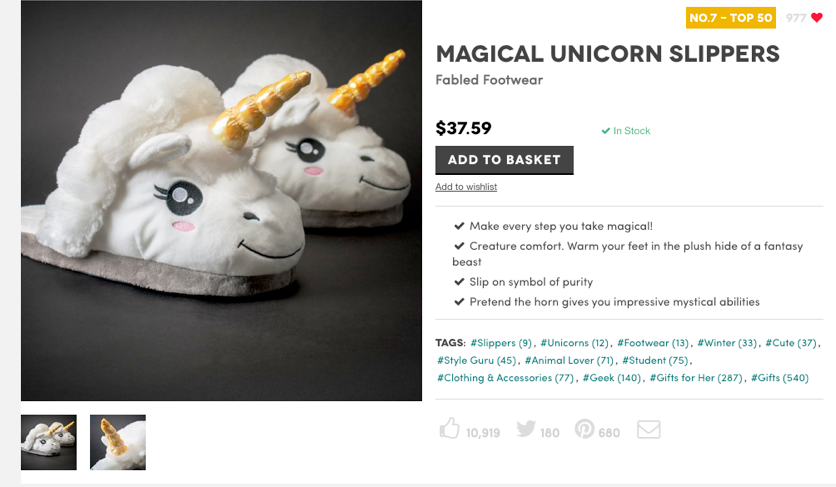
If
you take a look at the top of the page you'll notice how popular the
product is. Every visiter can click on the heart to show that they
like it, and so each product is rated, depending on how many votes it
gets.
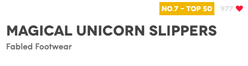
One
of the biggest reasons that we like the Firebox product pages is that
they include social buttons so that it can be shared across various
platforms.
The
person viewing that product may need a second opinion from their
friends, or they may know someone else who might be interested in
purchasing the product.
Using
a simple tactic like this, can really help bring more exposure to
your products.

What
can we learn?
Adding
social sharing can really help promote your products across the web.
Confidence builders - such as the voting button on Firebox - are
perfect in helping improve social proof and increase conversions.
Our
top tips:
-
Include
social share buttons next to your products
-
Encourage
people to vote if they like it
-
Include
a social tag to your social feeds and a link back to the product
Resources
to help further
Marketing
Land:
Social
sharing likes ecommerce
HubSpot:
The
ultimate cheat sheet for creating social media buttons
Woothemes:
How
to motivate customers to share your products
The
big takeaway
So
there you have it, our 7 top product pages that make us want to buy!
Understandably,
a lot of effort and testing goes in to creating a product page that
converts, but if we were to take one overall lesson from each of
these brands, it's that you need to
be
clear
with your audience.
Do you have any more awesome product pages that you'd like to add to the
list? Let us know in the comments below!