Creating
the perfect Ecommerce
store
is tough. With so many different elements to consider, how do you
know
what customers want to see and what they don't want to see?
At
AmeriCommerce, we can't reiterate enough that providing a great user
experience is essential to making that all important sale.
So
that's why we've put together this smart list of essential features
that you really need to include, if you want people to convert...
#1. A clear message
It's
true what they say, you never get a second chance to make a great
first impression. So when it comes to new visitors landing on your
site, they need to be able to understand what you can do for them
without them having to think about it.
At
this point it's all about using great design to tell the right
story.
You
need to make it abundantly clear what it is that you can offer them,
so that they can make the decision to buy. Your message needs to be
compelling, it needs to resonate with their needs, and it should show
them how your product can change their lives.
So
how do you fix it?
Make
it clear what it is you can do for them. A great place to start would
be your homepage because this is a first port of call for many.
MyOwnBike is a great example of a homepage done well. The reason it
works is because it's not even in English, yet it's evidently clear
what they sell; bikes.
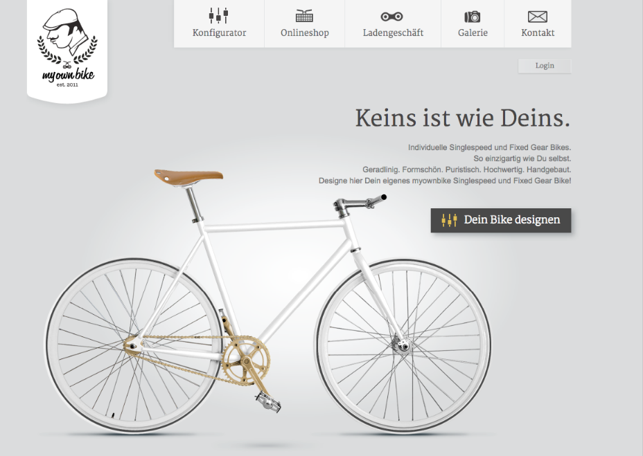
But
not only that, the user can go ahead and design a custom bike, right
from the homepage. This pushes the user onto the next stage of the
sale, as they get to see their own bike design brought to life.
It
features a clean design, the message is clear, and it effortlessly
moves the visitor along the sales cycle. Once you achieve this with
your site, you'll be providing a powerful first impression.
#2. An easy navigation
The
next element that we think is just as important as your message is
your web navigation. In fact we're not the only ones. According to
Hubspot, 76%
of consumers say that the most important factor in a website's design
is that it's “easy for me to find what I want”.
The
truth is, if a visitor cant find what they want then they are gonna
leave without a second thought. Your job is to move a visitor through
your site, without them having to put any effort in on their part.
Again,
it's all about making everything as simple as you can.
So
how do you fix it?
First
we'd suggest following the three click rule. That is, making sure
your visitor gets to every major product you offer in three clicks or
less. You can test it by starting from your homepage and count how
many clicks it takes to get to your top 10 products. If it's more
than 3 clicks then you'll want to re-evaluate your navigation.
Next
we recommend that you take a close look at your search navigation
bar. You need to make sure that you implement one that offers
comprehensive search functionalities so that customers can find
exactly what they are looking for.
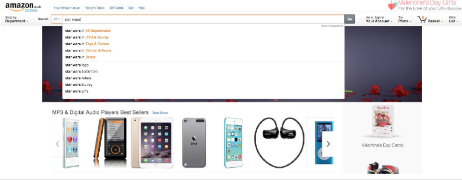
For
example, Amazon has a great search bar that will suggest products,
assign products in categories, and will even make recommendations
when a visitor spells a word wrong:
#3. Social sign up
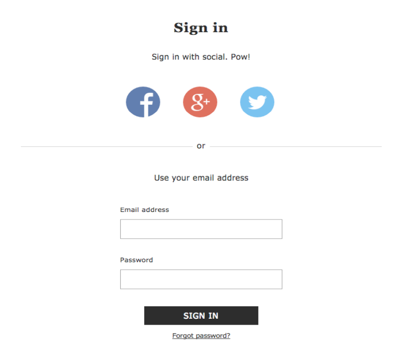
The
social sign up is a fairly new feature, but it's taking the Ecommerce
world by storm. Clearly you want your visitors to give you their
details, but sometimes this can be a little hard to achieve when a
person has to manually enter their name, email address, password and
then sign up for an account.
So
how do you fix it?
With
the click of a button, your customers can instantly connect their
social platforms to create an account, so they won't have to enter
any details. That way, you get their contact info and they get a
faster checkout! Various Ecommerce brands have adopted this method,
including Asos below:
#4.
Plenty of product images
So
when a person gets to your product page they wanna know what your
products look like, right? But if you only offer one image of the
product then this can really hinder your chances to get people to
click on the golden buy button.
How
do you fix it?
We
really recommend that you feature as many images as you can of your
product, so the customer can really get to grips with what they are
buying. Take plenty of pictures of your products in different angles,
styles and colors, so that you can help the customer make an
informative buying decision.
Check
out Betabrand
as a great example. Included on the product page for a shirt is a
total of 11 images, all for the same product. It shows close up's of
the shirt, it shows the model wearing the shirt in different
scenarios, and it even gives a detailed image of how the shirt has
been made!

It's
not just about the number of photo's either. You need to make sure
that the quality of your products really shine through. Think about
the camera device you want to use, getting the right lighting, the
position of your products and making sure you edit them with editing
software.
Related
reading: Take a look at our product photography
cheat sheet
to find out plenty of actionable tips on how you can create the
perfect visuals!
#5.
Responsive across every device
Our
final tip – and it's an important one – is ensuring that your
site works across every single device! With more and more consumers
now shopping with their smartphones, gone are the days that you can
get away with solely focusing on desktop users.
How
do you fix it?
When
it comes to designing for a mobile device, you need to think smaller
and simpler. You can't include as much information as you can for a
desktop, so you need to consider what your most important aspects
are. Can you lose some of the copy? Make sure your mobile version is
clean, simple, with clear links to your CTA buttons.
And
it certainly helps if you're using an Ecommerce
solution
that offers responsive themes as standard. Here at AmeriCommerce we offer
exactly that, so be sure to check out our features to find out more!
Grab
our free ebook!
As
you can see, providing a great user experience is all about making
life simpler for the people that visit your store! But, these are
just 5 examples of how you can improve your online store. If you're
looking for more then check out our free ebook with 13
mistakes that smart Ecommerce
owners make – and find out how you can improve your conversions
today!