If
you're in the planning stages of your online
store
then you're probably looking for plenty of inspiration on what makes
a great Ecommerce home page. We think the key to creating a
successful home page is ensuring that it reflects your brand, but how
much thought have you given to the story
of
your brand?
Why
is the story important?
From
your imagery, messaging, design and user experience, your story
is everything that makes up your brand. The reason it's so important
to get this right is because it helps to create an emotional
connection with your customers, and once the connection has been
made, they are likely to become your customer for life.
Did
you know that if you improve
retention rates
by just 5%, you can actually raise your profits by an incredible 95%?
A repeat customer is one of the greatest assets you can have, and it
all starts by effectively telling your story...
Where
do I start?
We
think the best place to start is on your home page, and if you've
read our previous
posts
then you'll already know that your brand needs to be consistent. But
what else can you do to make sure all the key elements are there, and
are working well together?
Take
a look at our top tips, plus examples of Ecommerce stores that use
our platform, to see how they have mastered the art of storytelling
on their home pages....
1.
Make your logo and messaging clear
When
a user first lands on your home page they should instantly know who
you are, and to get this right you need to make sure your logo and
messaging is prominent. Research shows that we are naturally drawn
to the top left of a page, which is typically why you will find most
websites follow this rule. But that's not to say you can't feature
your logo in the center
or to the right,
but you just need to make sure that it is the first thing you are
drawn to on your page.
The
very next step is to ensure your messaging or slogan is clear to the
user. What impression do you want to give to your customers? Your
message should go hand in hand with your logo as your audience should
know who are you are, followed by what you can offer them.
Take
a look at our home page as an example:
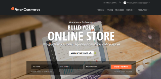
As
you can see, our logo is clear to see, and by using a very simple
message: “BUILD YOUR ONLINE STORE” - the reader will understand
within seconds of landing on our home page, what we can do for them.
2.
Feature stand-out products
In
addition to the logo and messaging, your product really needs to
stand out on your home page. Now we're not saying you need to feature
every product you have on your home page – that would make it too
cluttered, especially if you sell a lot! But there has to be a focus
on what you sell, and it needs to attractive and noticeable to the
reader.
As
we move towards 2015 it's clear that websites are becoming extremely
visual. Many Ecommerce stores now feature a large hero image, that
tend to be in the front and center. Your hero image needs to have the
'wow' factor in order to tempt your customers to continue shopping.
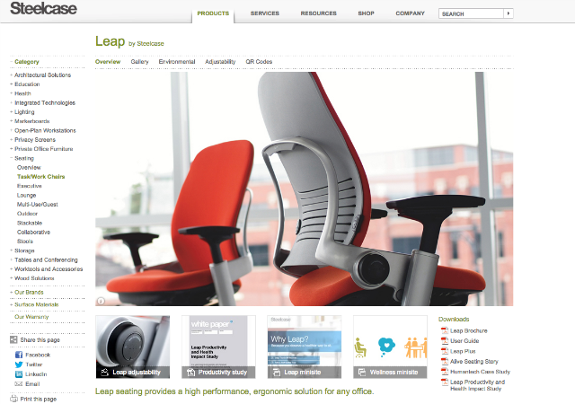
As
you can see from the Steelcase
example below, they have mastered the art of a great hero image:
If
you want to feature more than one product, then you can always
implement a rotating banner so that it features a variety of
different products. If you do this, make sure you don't use too many
rotations as this can harm web load times and be off-putting to the
user.
Check out the Rvinyl
website for the perfect example of this.
3.
Craft powerful headlines
The
headlines that you use on your home page can really help to create
your brand story. You should aim to use headlines that will connect
with your customers emotions and make them want to take action on
what you are telling them.
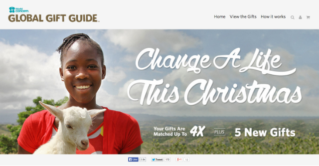
For
example, the Global
Gift Guide below
asks the reader to “Change a life this Christmas”.
This
is so powerful as it connects to the reader's emotions by putting the
focus on people less fortunate during the holiday's. It also gives
the reader a sense of empowerment by telling them that they can
really make a difference to a person's life during a time that should
be enjoyable.
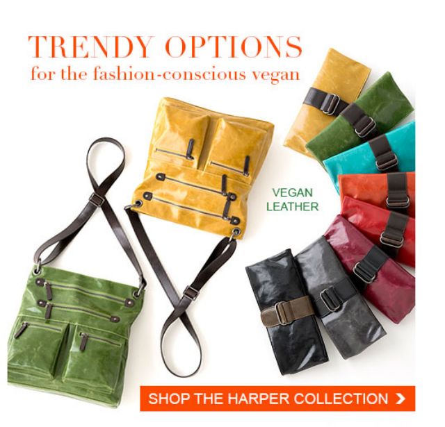
Another
great example is from ShopInspiredLiving.com
as they have really got to grips with who their audience is. Their
image below is taken from their home page and it represents the type
of products they sell, and targets a vegan audience who want to shop
for 'trendy' products. It's simple, effective and it really reflects
the brand.
4.
Create a seamless user experience
The
navigation is another important factor as you need to provide a great
user experience, in order to tell the right kind of story. You should
try not to clutter your top navigation bar with too many options as
this can overwhelm the user. Keep it clear, simple and always keep in
mind the path that your customer will want to take.
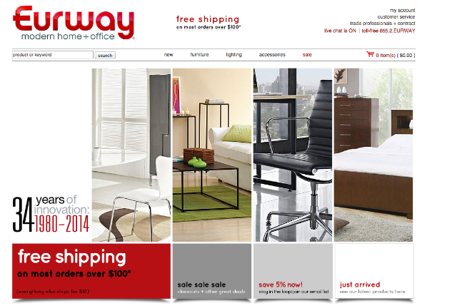
As
you can see from the Eurway
example, they have just five tabs with a drop down option on each, so
that the user can be more specific if needed. Each option leads the
user to a specific type of product and they are labelled as: new,
furniture, lighting, accessories and sale. This gives a clear
indication as to what the company sells, and offers a simple way to
navigate through the website.
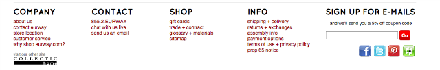
If
you do need to put extra information on your home page, then you
should think about placing this at the bottom. Many users will look
to the bottom of your page for customer service, company information,
contact details and social tabs. Below is the bottom navigation bar
on the Eurway home page as an example:
Let
us help build your store!
Hopefully
this article will have provided you with plenty of inspiration on how
you can effectively tell your story on your home page. But why stop
there? We can provide you with a powerful ecommerce software solution to build a successful
online store. From design, marketing, social engagement,
integration with other apps and more, our platform offers everything
you need to become an Ecommerce pro.