A landing page is, in simple terms, any web page on your site that users land on. In Ecommerce, the landing pages we focus on are primarily product pages. This is because it's better to send your potential customers (from a search result or an ad) directly to a product page rather than your homepage, where they would have to navigate through lots of pages to get to where they want to be.
Getting users to your site can be difficult, but unfortunately, it's only half the battle - you have to make sure they stay and convert, too! The attention span of human beings is becoming notoriously short, with some studies comparing it to that of a goldfish! So, how do you optimize your landing pages to make sure that people stay and convert?
Well, in this article we're going to show you. We've compiled a list, using examples from our own customers' Ecommerce sites, of 10 ways you can optimize your Ecommerce landing pages.
1. Awesome Images
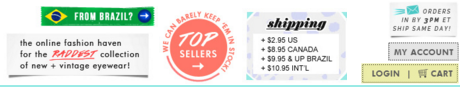
People like pictures. It's a quick way for information to be digested, and in Ecommerce it's even more important, because it allows us to see products before hitting the 'Add to Cart' button. Take a look at this landing page for
bleudame.com:
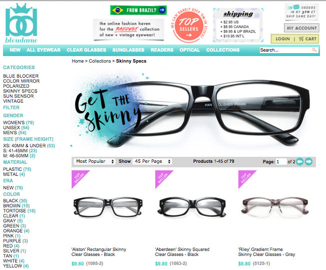
This landing page, showing their collection of "skinny specs" gives potential customers a clear view of the product they would be purchasing. This increases trust and gives users more confidence in the product they are buying, and the site they are buying from.
BleuDame even goes one further by showing the glasses on models when you scroll over a pair you like:
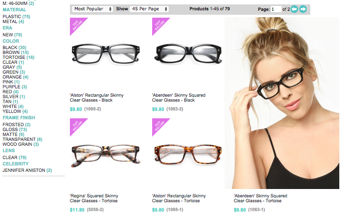
When it comes to optimizing your landing pages, it's not important for your images to be particularly artsy or flashy, it's just important that the image is clear and the product can be seen in the best light -- making it look as attractive as possible to any potential customers.
2. Stay Above the Fold
Keeping as much information above the fold as possible is important for maintaining the attention of your website visitors. If potential customers don't see what they are looking for right away on your page, you risk losing them. Take a look at the
Rug Studio landing page below:
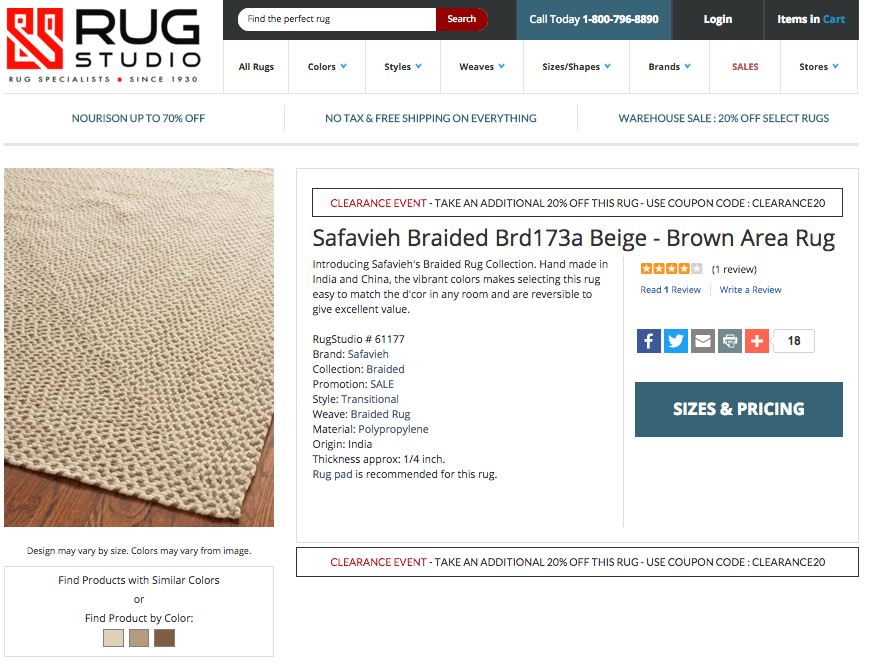
There is so much information here, and it's all above the fold. All customers have to do is click. The key point here is that you're trying to make this experience easy for the customer. The easier it is to buy things from your site, the more conversions you'll get!
3. Simple Navigation
Simple navigation can mean the difference between a customer converting and running in the opposite direction. As mentioned in the point above, it's all about making the experience easy for your customers.
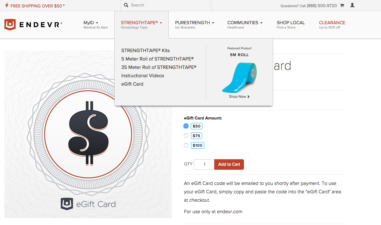
This
Endevr landing page is a great example of simple navigation:
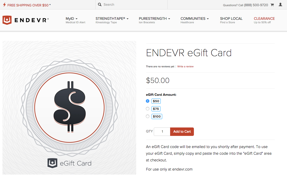
The user can change the amount on the gift card without even leaving the page. And, if the user does want to shop for something else, the numerous tabs at the top of the page have detailed drop down menus to direct them to the right place:
4. Whitespace
The term "whitespace" refers to all of the empty space on your landing page. You may see empty space as kind of a waste, but it actually helps users focus on the more important things on your page. Take a look at this landing page from
West Coast Shaving, and note where your eyes travel:
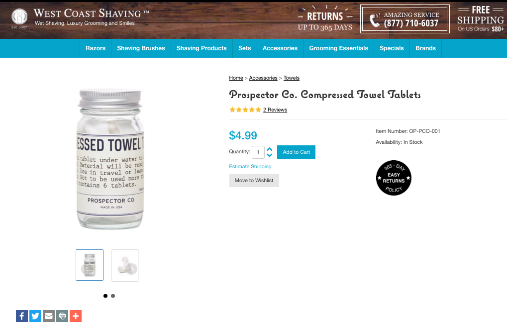
The first thing that stands out is the product image. It's clear, it's the largest thing on the page, and there is a lot of whitespace around it. After this, the eye tends to travel towards the call to action button, followed by the price, and the black "Easy Returns Policy" sticker. The sheer volume of whitespace emphasises what matters, meaning the customer's eye is never drawn to anything that distracts them from converting.
5. Engaging Copy
Like with images, it's also important for the copy on your landing page to be clear rather than flashy. People want to know what they're getting, and they want to know as quickly as possible. This landing page copy from
nurturemybody.com is a good example:
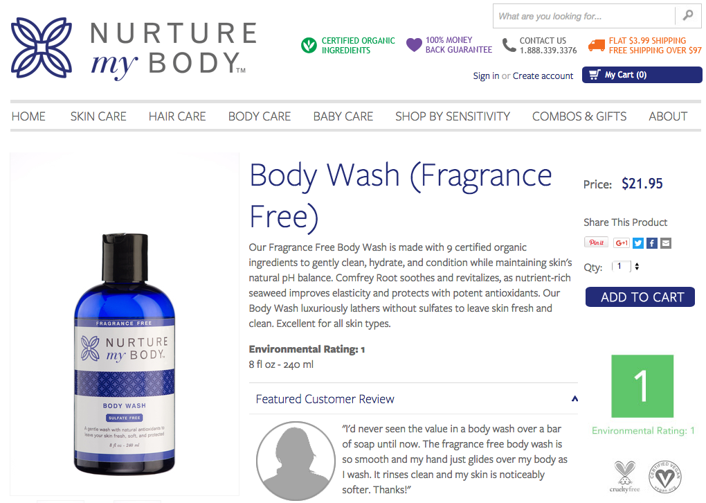
The copy is short, clear, and to the point. The copywriter has used just the right amount of punch to persuade the user to buy without boring them with too much information. The more important points are also broken down so that users can see, at a glance, the benefits of buying this product:
Environmental Rating 1
8 fl oz -- 240 ml
6. Customer Reviews
Including customer reviews on your landing pages will improve your conversion rates because people trust other customers more than they trust your business -- sorry! But it's the truth!
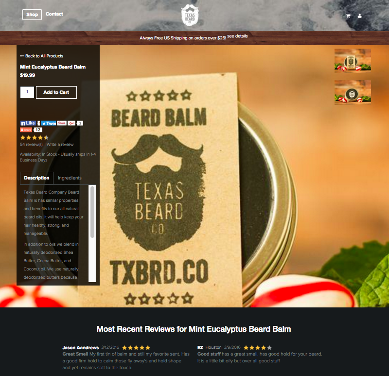
To the left of the page, you can see very clearly that this product has 54 reviews, averaging out at 4.5 stars. Also, two of the most recent reviews appear above the fold, jumping out at customers instantly. If you still aren't convinced, you can scroll down to read tons of customer reviews.
Another great way that reviews optimize your landing pages is by improving your SEO. Take a look at this search result for the landing page above:
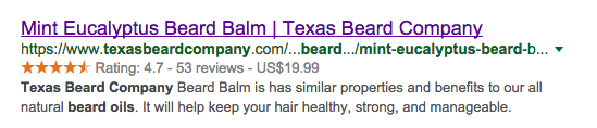
The reviews show up in search results, further encouraging people to click on this result.
7. Social Share Buttons
Almost every landing page we have shown in this article has social share buttons on display somewhere. This is because, like engaging copy and reviews, social share buttons can also improve your SEO. Search engines like to provide users with the most relevant results, and the more social proof a page has, the more reliable and relevant it will seem to search engines.

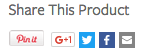
So, if one of your customer's wants to share your product or service with a friend, then why not make this easier for them?
Studies have proven that social sharing buttons can increase landing page conversion rates by
9%!
8. Include Contact Information
Including contact information on your landing pages will help you increase conversion rates because it shows that you are available and happy to be contacted, which instills trust.

Contact details also help to show customers that you are friendly and accessible. You can further enhance this with a
live chat function.
9. Clickable CTA Button
Your call-to-action is the most important component of your landing page. It has to stand out and make customers want to convert. An example from
ACLU reflects this:
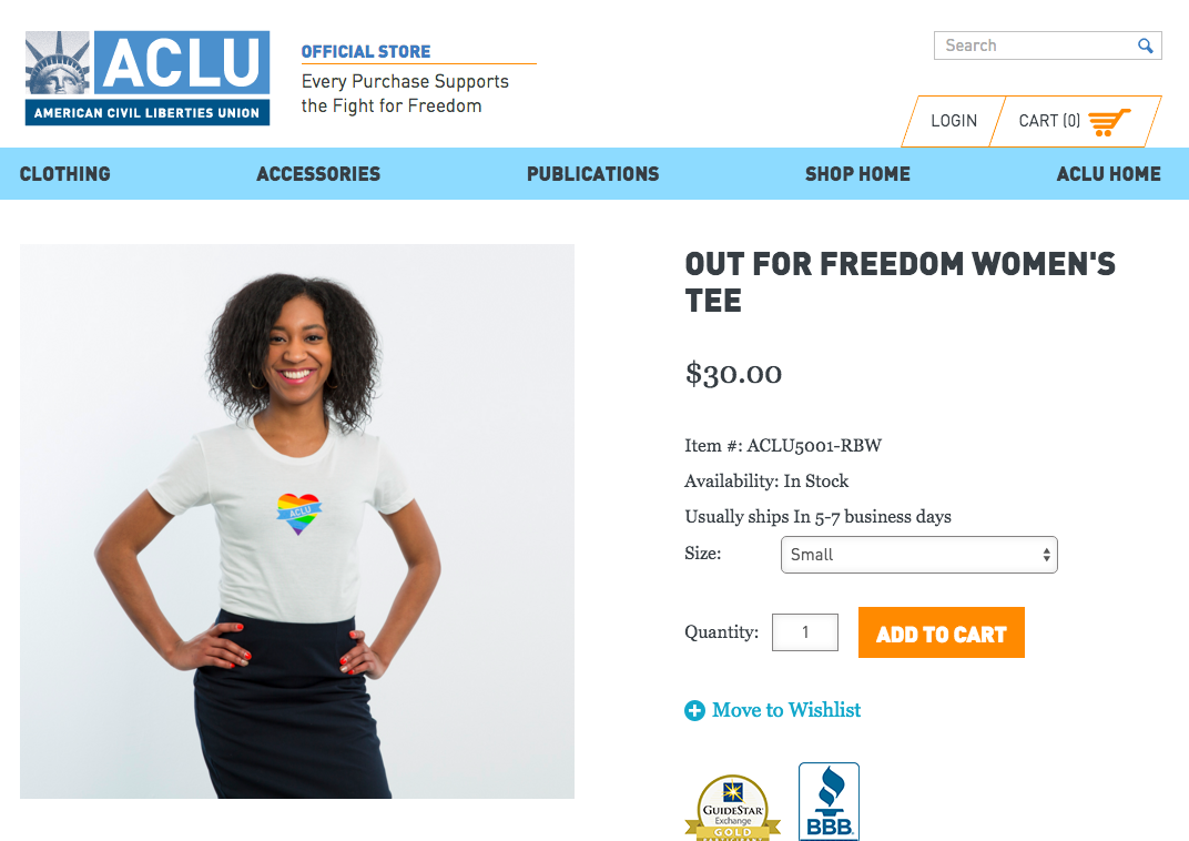
The call-to-action button is bright orange, which makes it stand out among the white and blue background colours. The text is also very clear, telling visitors to the site exactly what they need to do.
10. Special Offers
Including special offers on your landing pages will help you optimize for insane conversion rates!
After all, who doesn't love a special offer?
A great offer could mean the difference between a customer converting and telling their friends about you, or clicking away from your site and forgetting about you forever.

As you can see from the special offers above, you don't have to promise anything spectacular, just a small incentive to encourage website visitors to commit to becoming customers.
Closing Thoughts
If you want to see an increase in your conversion rates, then optimizing your landing pages is a great way to start.
All of the 10 points in this article may not apply to your business, but, the more you optimize your landing pages in the ways shown above, the better your conversion rates will be!